A fresh coat of paint for Trema, my publication about the books I loved reading
September 8, 2025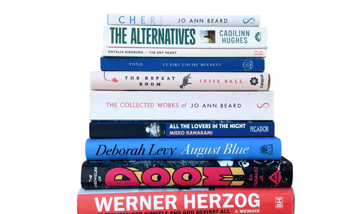
In December of 2022 I started Trema, a website and monthly newsletter where I could write, briefly, about the books I loved reading. Primarily, it was a way for me to practice such writing. Secondarily, I think my friends appreciated me leaving them to it, channeling my ramblings about books they must read into a centralised location they could choose to ignore.
For a designer starting a publication, the immediate urge is to design the thing first. Make a little logo, pick a few colours, set the typography. I purposely decided against doing any of that, to begin with. My goal was to write and publish one post every month, which meant reading at least two books in four weeks; if I’d read just one and couldn’t recommend it, I’d have nothing to write about (thankfully, at the time I was reading three to four books per month, so this wasn’t so daunting).
It seemed wise to trial this for a while, to see if the habit stuck. Using Ghost, I picked their standard theme, a background colour, and a common, built-in typeface, and I was off to the races. Last December, nearly two years in, I decided the habit stuck long enough for me to start thinking about properly personalising the online publication I was building.
A calm, warmer reading experience
Most of my readers read Trema in their email inbox. Only a fraction click through to the post on the web, and that’s fine. And yet, for those who do, I was itching to create a calm, outstanding reading experience of my own, and to learn how to build a custom Ghost theme in the process.
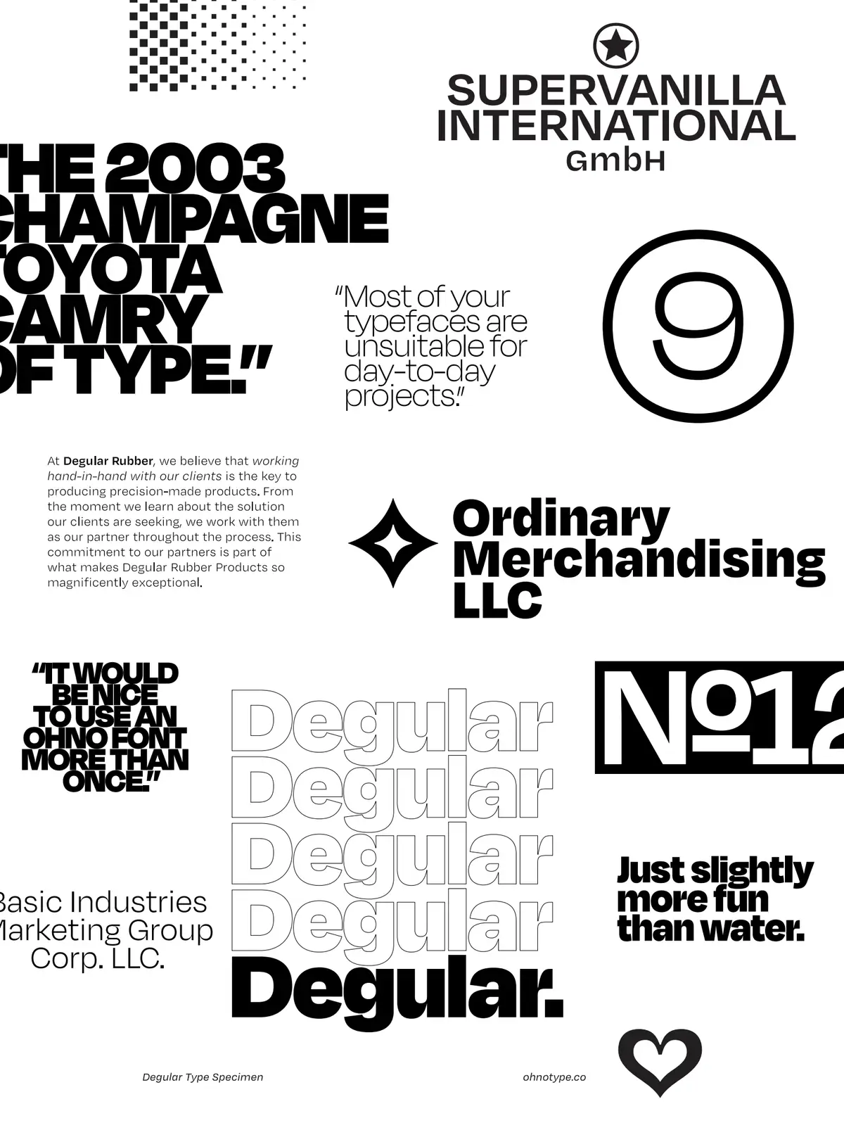
Building my personal website (this one, right here), a month or two ago, sped up some decision-making. I’d bought two typefaces for it, Degular and Blanco, and immediately knew I’d be using them for Trema, too. Degular works great for headlines, and has quite a bit of character when you blow it up to larger sizes; Blanco is very well suited for longer texts, and reads comfortably. Using the same typefaces once more, I’d be able to create a bit of unity between both of my sites.
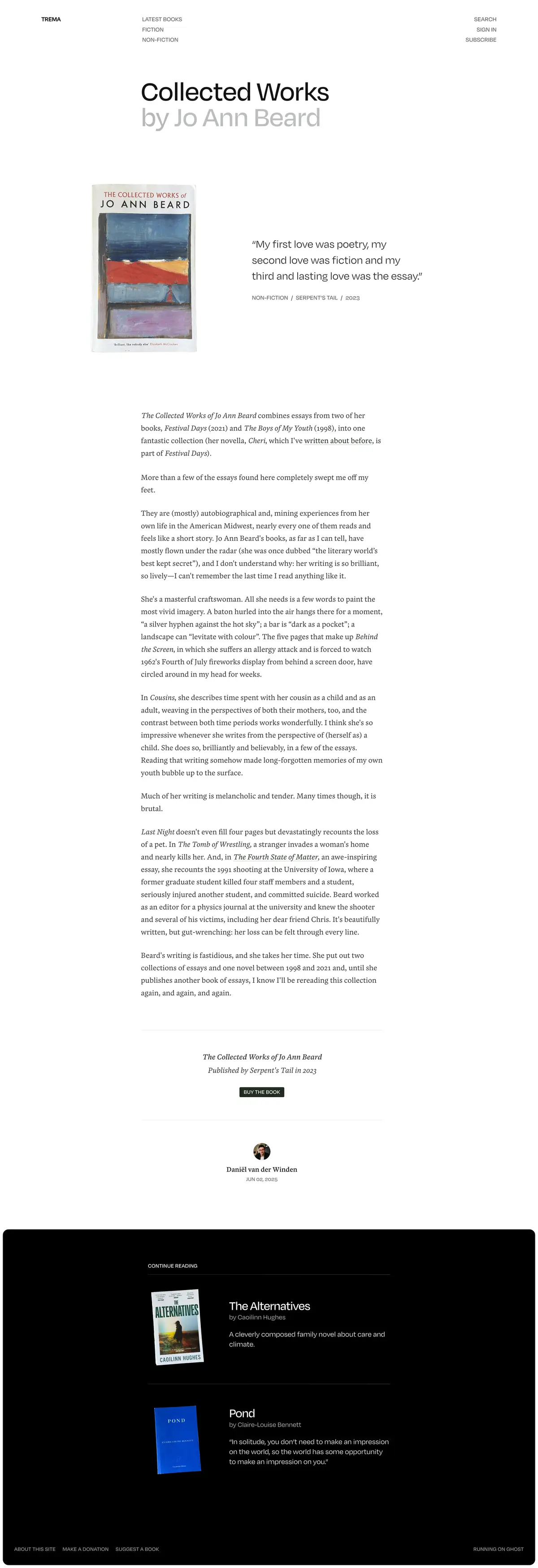
While building this site, I had decided to include a page, /newsletter, where I’d link to my posts on Trema. To make that page feel warmer, I had the idea to photograph every book I’d recommended. I’d relied on digital images up until then, and I thought this change would make the page come across a tad more human, resembling a glance at my bookshelves rather than a peek at my computer’s file system. Testing this approach with some photographs, I liked the outcome, and the digital images from before immediately felt very sterile in comparison.
A few of the books that I’d read on my Kindle, I bought on paper. I photographed nearly every book myself, with one or two exceptions for the ones I still need to purchase, and added them to the page. And, immediately, the combination of the typography and photography clicked for me, informing how I wanted the heart of the publication—a book recommendation—to look.
I’d saved screenshots of different sites over the course of a few months, building up a small reference library, but this little exploration was the final push for where I wanted to take things: big photographs of the book’s actual, beautiful paper cover, flanked by large typography and a refined and legible body text.
I mocked up a little sketch in Figma and decided to start building it straight away. If I could build the heart of the publication to my liking, the rest would follow.
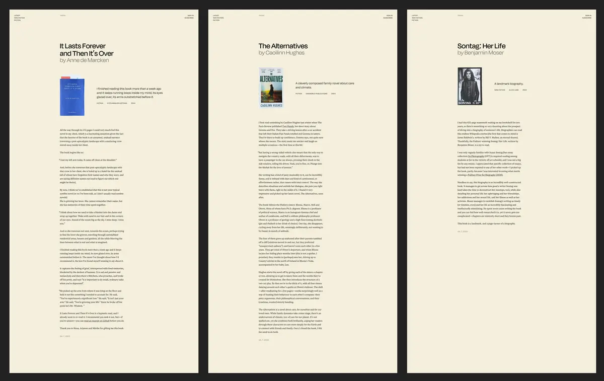
Most of my time went into getting that page right. Creating a pleasing grid, breaking out of it with purpose, and making it a joy to read on a phone, too. I had a lot of fun with that (and, fortunately, roughly 30 posts to test my idea on).
Using Ghost’s built-in tags a little creatively I could accommodate the design. Without getting overly technical: I tag every post, and its first tag is the name of the book’s author, which is then pulled out below the book’s title; the rest of the tags simply appear below the excerpt.
Automatically populating collections
All tags, then, are clickable, which creates space for building collections. You can now see which publishers I’ve read books from (Fitzcarraldo Editions and Canongate lead the way), and click through to authors or years of publication, too. Here’s Miranda July, or Jo Ann Beard. And, here’s 2024, or 2015.
And, I’ve built a page that automatically populates and shows all authors, in alphabetical order.
The index I kept fairly simple, pulling out my latest few recommendations across fiction and non-fiction, and moving readers onto new things to read as quickly as possible.
Chipping away at a well-rounded publication
All of this now allows me to create a much more extensive and well-rounded publication simply by continuing to write about the books I loved reading, which I’m quite chuffed about. Collections build up automatically, deepening the potential rabbit holes readers can go down with every additional book I add; I want you to land on one of Trema’s pages, tumble down that rabbit hole, and appear out the other end with one or two new books to buy and immerse yourself in.
To quote Rebecca Solnit (No Straight Road Takes You There, page 173):
I am a writer because I am a reader, and readers share a faith in books—in the practice of quieting down and going deep, in the power of accurate description, in the passion to understand what the meanings and possibilities this life offers us are.
Up next: illustrations, improvements, and returning to regular publishing
In the coming months I’ll be commissioning a friend to create an illustration or two that I can intersperse in certain places, adding a bit more character to the publication without interfering with the book covers. I’m still testing the waters when it comes to functionality and responsiveness, too: if you find something that looks off on the device you’re reading Trema on, feel free to let me know via email or Bluesky.
None of this is ever truly finished, but it’ll serve me right for years to come.
Throughout all this I’d parked recommending a new book for a month or two. I couldn’t fathom publishing knowing the upgraded reading experience I had up my sleeve. Now, my latest post went out today, and I have a few in the works for the months ahead, picking up my regular pace of publishing again from here on out.
If you’re already a reader of Trema, I appreciate it. If not: you can subscribe via email or follow along via RSS.
For now, thank you for reading.