Links / Branding
-
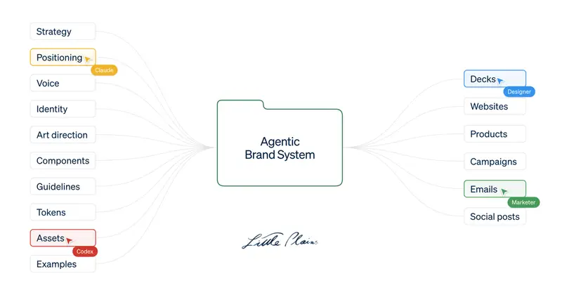
Image courtesy of Little Plains Little Plains makes the case for Agentic Brand Systems: kits of visual rules, voice guidelines and working code that guide people and agents alike, so a brand doesn’t drift as it spreads across more tools and teams.
Give the same assignment to an agent and it guesses at a much higher rate. The result may look completely competent. However, each unsupported choice moves the work a little closer to what a generic product would do. It’s not slop, it’s just…mid.
Interesting times for brand studios, and for those commissioning them. Scaling a (re)brand is becoming (unavoidably) more agentic. Rolling out and levelling up a company’s brand expression is technically easier than ever, but the surface area you need to cover has grown quite a bit. We’re going to need to grow a few extra pairs of eyes.
-
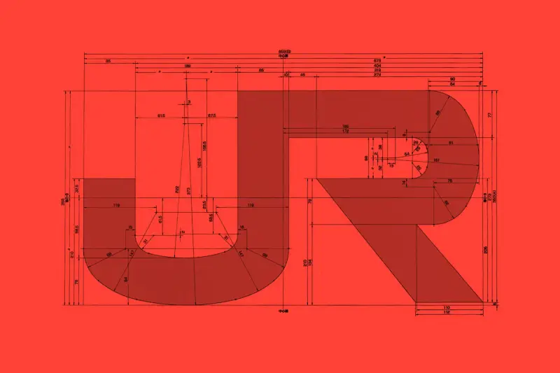
Arun Venkatesan outlines how Japan’s railway companies all carry one logo across thousands of vehicles, maintaining a distinct, shared visual identity for what is actually eight different organisations.
[...] the new corporate identity was commissioned as a single system that would apply across all the companies. In just 124 days — beginning with the passing of railway reform bills — the new JR companies launched across Japan, with new branding applied to every vehicle. The brief was minimal. The designers were given full control, told only that the group had to be called either “Japan Railways” or “Nippon Railways”. It was up to them to find a solution that worked aesthetically and within the constraints.

Workers applying the JR branding. Image courtesy of NDC Great story for a great brand identity. Perhaps unsurprisingly, its design process is reminiscent of Studio Ghibli’s, in that an older man struggled to delegate the design work to a younger team, and pulled all-nighters to deliver it.
-
The Quietus, revamped
№ 109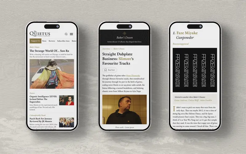
Earlier this year I noticed The Quietus got revamped, and I’ve been reading their work much more since then. The glow-up was done by 11:11, who took on the branding, design and development work.
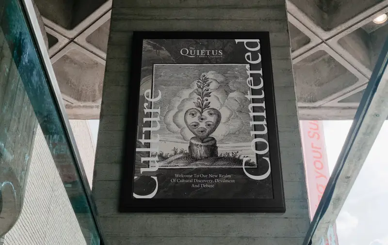
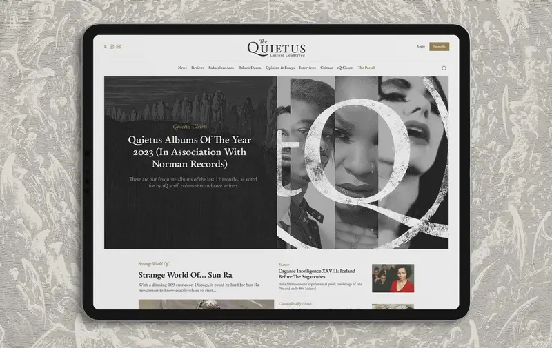
The revamped The Quietus, all images courtesy of 11:11 I appreciate the tactile nature of the work; the combination of the typography and illustrations makes the site feel ‘reader-first’, if that makes sense—as opposed to most similar sites, where the writing is buried beneath a pile of ads, waiting to be excavated.
-
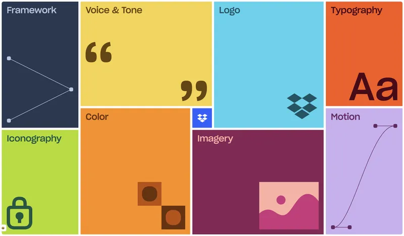
I recently stumbled upon Dropbox’s (new?) brand guidelines, and the site they’ve put together for it is incredibly well done. Every chapter has its own interactive elements, the animations are perfectly executed, and none of it is overcooked. Impressive!