Links / Design
-
McLaren revealed an evolved identity this month, the road cars and the racing team now sharing the same voice.
The Speedmark stays, and so does the Papaya colour. What’s new is the wordmark, sourced from the service station that Bruce McLaren’s parents, Les and Ruth, ran in Remuera, Auckland. That’s where Bruce McLaren built the car that won him his first race.
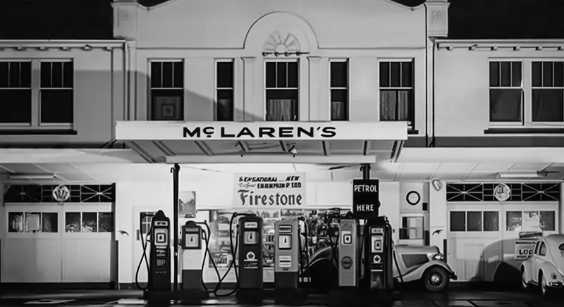
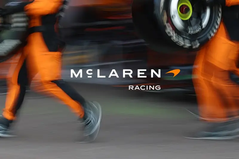
The service station in Remuera, and the new McLaren Racing lockup, images courtesy of McLaren I’m not sure how I feel about the new McLaren Racing lockup—the previous logo, still featured in the navigation bar on the McLaren Racing website, felt more… race-y? The production quality of the film itself, though, is extraordinary. The storytelling is very well done. Restrained, but crackling.
-
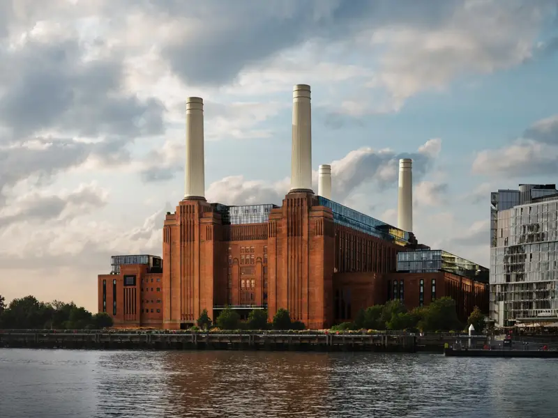
Apple opened a 600-capacity venue inside Battersea Power Station yesterday. The room borrows from the power station it sits in—heritage brickwork, fluted arches, bronze balconies. In an age where concert venues are usually not much more than a black box with a logo over its door, this looks beautifully done.
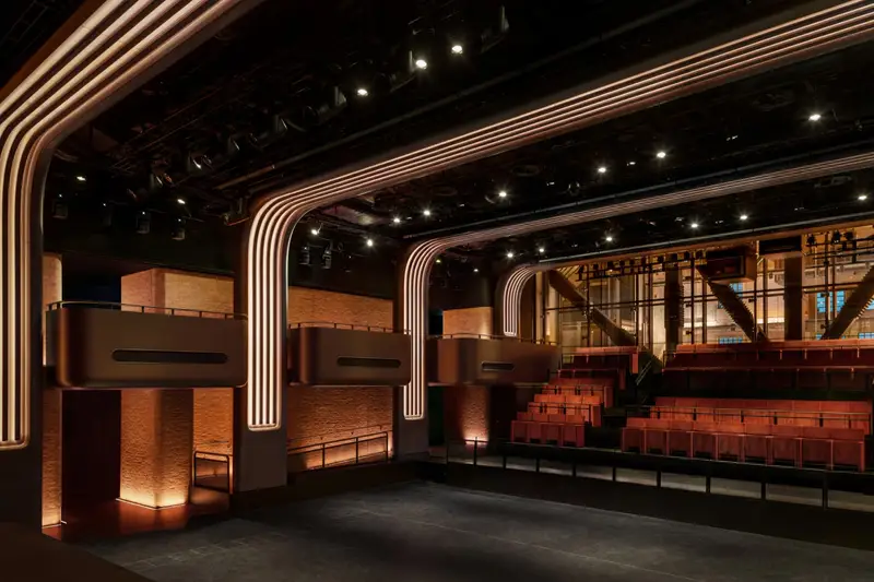
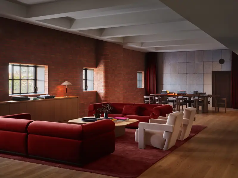
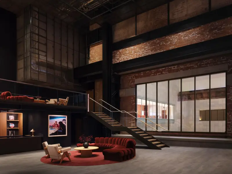
Apple Music Hall and the new Apple Music Radio studios, images courtesy of Apple There are two mix studios, a 48-speaker spatial system around the audience, and sixteen-odd hardwired cameras feeding a broadcast control room. An artist can play one intimate show and leave with a finished Spatial Audio recording, a broadcast mix and multicamera video.
Very clever, and a very expensive way of funneling listeners to an Apple Music subscription. (I guess this explains the push notification I received for a new two-month trial.)
-
Matthew Butterick’s Practical Typography—reader-supported, ad-free, and still one of the most useful things to read on typography I know. Published on the web since 2013.
Start with “Typography in ten minutes”, five rules that will, as he puts it, make you “a better typographer than nearly every writer—and even most graphic designers”.
My personal favourites to nerd out on: straight and curly quotes, ampersands, paragraph and section marks.
-
A 26-minute documentary by NYT Cooking on what makes a good restaurant sign, and what they mean to a business. They look at New York City’s iconic lettering with the artists behind Noble Signs, who hand-painted signs all over the city. Wonderful work.
-
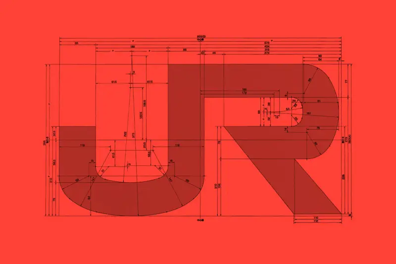
Arun Venkatesan outlines how Japan’s railway companies all carry one logo across thousands of vehicles, maintaining a distinct, shared visual identity for what is actually eight different organisations.
[...] the new corporate identity was commissioned as a single system that would apply across all the companies. In just 124 days — beginning with the passing of railway reform bills — the new JR companies launched across Japan, with new branding applied to every vehicle. The brief was minimal. The designers were given full control, told only that the group had to be called either “Japan Railways” or “Nippon Railways”. It was up to them to find a solution that worked aesthetically and within the constraints.
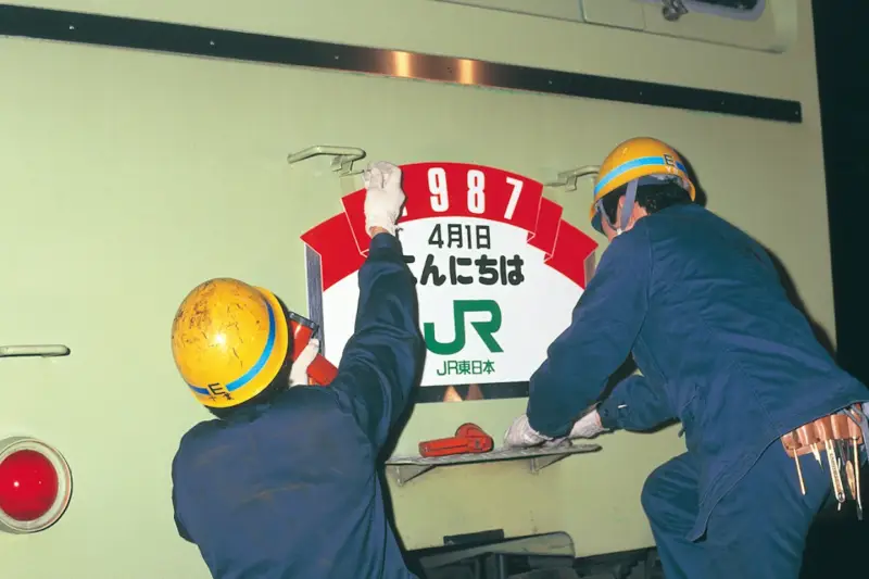
Workers applying the JR branding. Image courtesy of NDC Great story for a great brand identity. Perhaps unsurprisingly, its design process is reminiscent of Studio Ghibli’s, in that an older man struggled to delegate the design work to a younger team, and pulled all-nighters to deliver it.
-
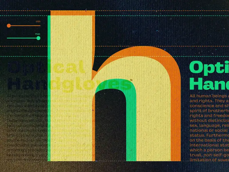
For five centuries, every typeface size was its own unique design. What we now call optical sizing—the practice of adapting a typeface’s design for different sizes to keep it readable—is a modern attempt to preserve that deliberate design choice to honor size-specific type, even though the physical reasons for it no longer apply.
A nice reminder by Elliot Jay Stocks on optical sizing in typography, and how variable fonts quietly restore this craft. Using
opsz, the browser already mapsfont-sizeto the right optical size for you, but you can take it one step further and tweak it by hand for different resolutions (as Elliot has done on his personal website).Similar to his, my site uses Oh No Type Co’s Degular too, and I have optical sizing enabled as well. You’ll see it render differently in page titles than it does in the inline
opszhere in the body copy. -
Current: an RSS reader
№ 129I linked to Terry Godier’s thoughts on RSS before.
He followed them up by launching his own RSS reader, Current. It has no unread count: new posts arrive, linger for some time, and then quietly fade away.
A lot of deep thought went into its creation and, the occassional UX niggle aside, I find it very pleasing to use.
I’m glad he turned the concept of RSS upside down and gave it a good shake. (I do hope the square-shaped macOS icon will be updated soon!)
-
Phantom Obligation
№ 125Terry Godier on why RSS readers (still) look like email clients, and why that means the design has guilt built-in.
He asks Brent Simmons, the designer of the first RSS reader, NetNewsWire, who says:
The part I don’t understand and can’t explain is why RSS readers are still mostly following this UI. But every new RSS reader ought to consider not being yet another three-paned-aggregator. There are surely millions of users who might prefer a river of news or other paradigms. Why not have some fun and do something new, or at least different?
-
I’m a fan of Matt Willey’s work. I found him through INQUE, the large-format annual literary publication he designs, and followed his work since. Here he is speaking at Typographics 2025 about designing TV titles for, among other things, Killing Eve. (He also designed the titles for Landscapers, a great show I had entirely forgotten about.)
Cheers to Charlie for sharing.
-
The Quietus, revamped
№ 109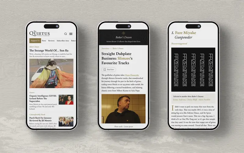
Earlier this year I noticed The Quietus got revamped, and I’ve been reading their work much more since then. The glow-up was done by 11:11, who took on the branding, design and development work.
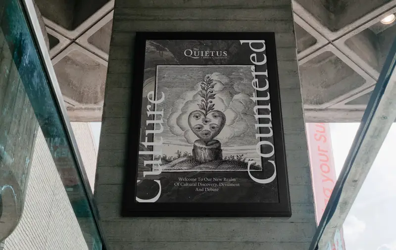
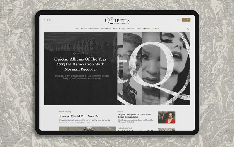
The revamped The Quietus, all images courtesy of 11:11 I appreciate the tactile nature of the work; the combination of the typography and illustrations makes the site feel ‘reader-first’, if that makes sense—as opposed to most similar sites, where the writing is buried beneath a pile of ads, waiting to be excavated.