Links / Typography
-
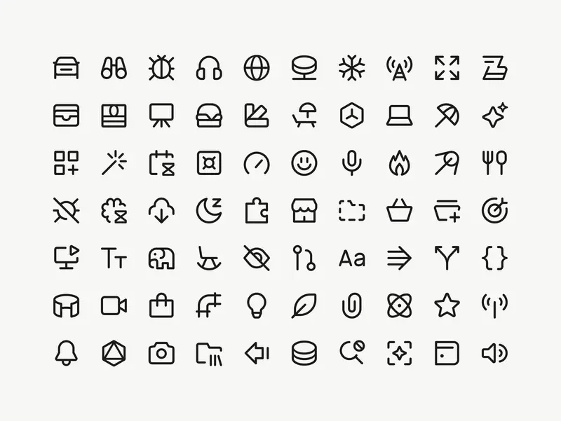
Images courtesy of Marek Minor I’ve worked with Marek for years, on projects for IKEA and AutoStore among others, and have always admired his system-level thinking, his craft, and his attention to detail. This project for Cursor is the perfect showcase for all of those abilities. The case study is lengthy, but anything shorter wouldn’t do the work justice.
At 1px the icons felt too thin next to text. It’s hard to say exactly why – they just didn’t hold their own. At 1.5px they felt too heavy. At 1.25px a 16px icon sits beside 16px Cursor Gothic, their custom typeface, and looks just right. You follow your eye on decisions like this. At some point the number is a record of a decision the eye already made.
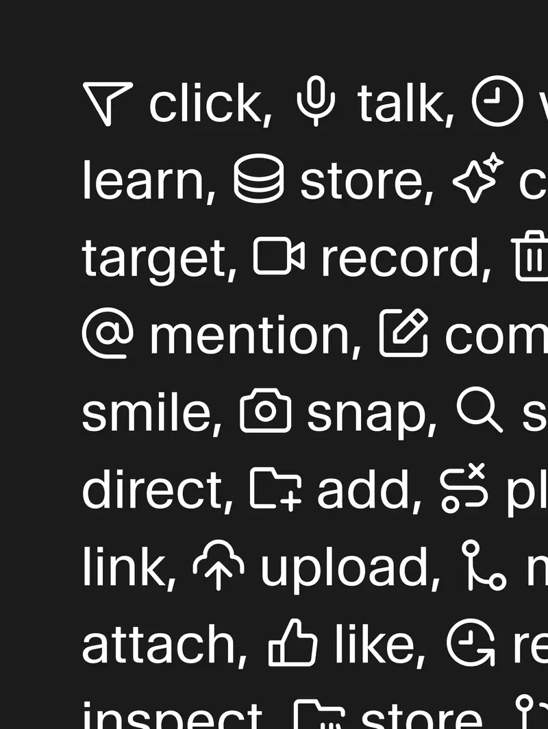
The icons set inline with Cursor Gothic The icons sit perfectly next to Cursor Gothic, and I love seeing this level of craft get prioritised in a product and company like theirs.
Marek walks through the explorations, the dead ends and the reasoning behind every decision, and with this case study he’s created a generous resource for anyone learning the craft.
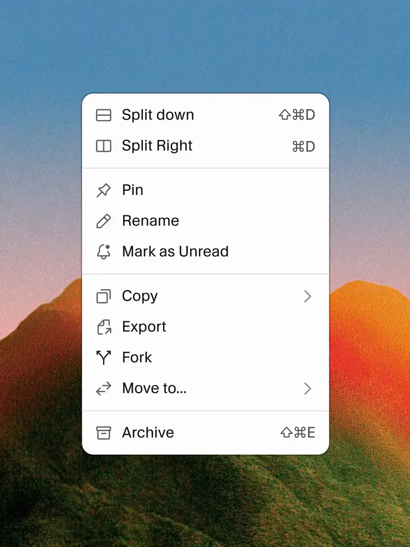
The icons in one of Cursor’s context menus -
Matthew Butterick’s Practical Typography—reader-supported, ad-free, and still one of the most useful things to read on typography I know. Published on the web since 2013.
Start with “Typography in ten minutes”, five rules that will, as he puts it, make you “a better typographer than nearly every writer—and even most graphic designers”.
My personal favourites to nerd out on: straight and curly quotes, ampersands, paragraph and section marks.
-
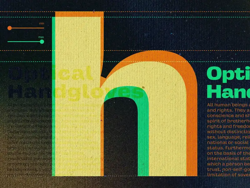
For five centuries, every typeface size was its own unique design. What we now call optical sizing—the practice of adapting a typeface’s design for different sizes to keep it readable—is a modern attempt to preserve that deliberate design choice to honor size-specific type, even though the physical reasons for it no longer apply.
A nice reminder by Elliot Jay Stocks on optical sizing in typography, and how variable fonts quietly restore this craft. Using
opsz, the browser already mapsfont-sizeto the right optical size for you, but you can take it one step further and tweak it by hand for different resolutions (as Elliot has done on his personal website).Similar to his, my site uses Oh No Type Co’s Degular too, and I have optical sizing enabled as well. You’ll see it render differently in page titles than it does in the inline
opszhere in the body copy. -
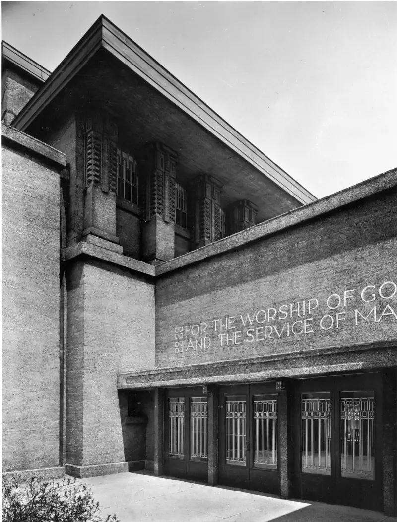
Image from The Frank Lloyd Wright Foundation Archives A geeky typographic deep-dive into upside-down H’s.
-
I’m a fan of Matt Willey’s work. I found him through INQUE, the large-format annual literary publication he designs, and followed his work since. Here he is speaking at Typographics 2025 about designing TV titles for, among other things, Killing Eve. (He also designed the titles for Landscapers, a great show I had entirely forgotten about.)
Cheers to Charlie for sharing.
-
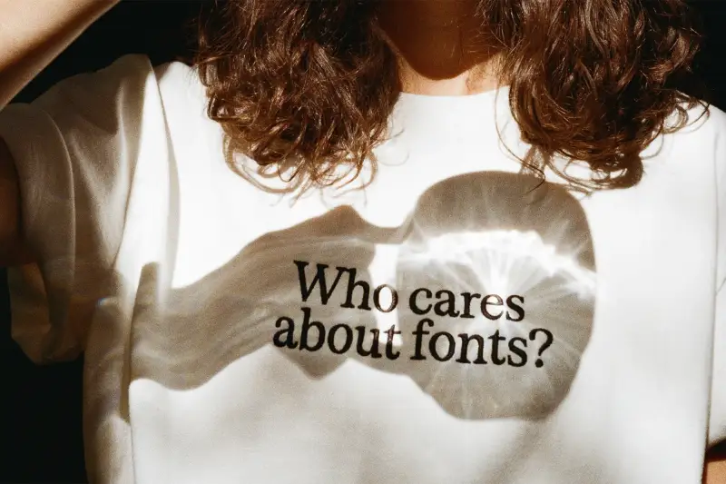
T-shirt design by Andrea Vacovská, photography by Viktorie Macánová Over on The Brand Identity, Daniel Quisek explains how the Prague-based type foundry Displaay has overhauled its licensing and reimagined its website.
The new licensing model strips away the usual complexity. Instead of tracking device counts, managing web traffic metrics, or navigating tiered user structures, it comes down to one question: how many people work at the company? That’s it.
On top of that, they offer individual styles and custom variable packages. They even allow you to take out characters you don’t think you’ll use, and you can test everything for free on their website.
This kind of flexibility is very non-standard in the world of type foundries, but may gain traction from here on out.
Oh, and did I mention their new typeface, Serrif? What a beauty.
-
Ode to the Dinkus
№ 97
The Dinkus Three months ago, I was a normal person. Now all I think about 24-7 is the dinkus.
I use the word dingus a lot, and had no clue that a line of three asterisks (***), often used to create a breather between two paragraphs of writing, was called a dinkus. My sincere thanks to Đorđe, who suggested I have a custom one made for Trema.
The dinkus, mind you, is not to be confused with the asterism (⁂). Daisy Alioto, writer and dinkus influencer, explained it all, years ago, over on The Paris Review.
-
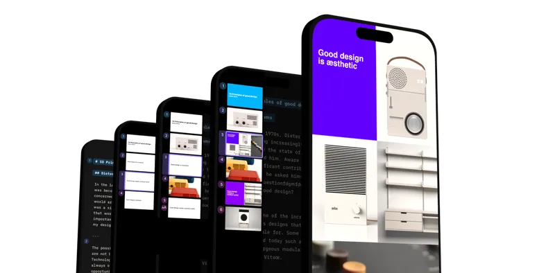
iA Presenter. Image by Information Architects iA Writer has been my go-to writing app on Mac and iOS for over a decade, but I’ve never properly gotten stuck into iA Presenter. Its release coincided with my role shifting, and having to create fewer presentations as a result.
They’ve now released version 1.5 of their app, which has seen them strip away even more of its features to benefit the primary workflow, and I can really get behind their reasoning.
PowerPoint and similar apps start by letting you pick a design. Making your presentation look good right away sounds helpful. But in practice, it distracts. It shifts your attention to how the slides look instead of what you want to say.
Putting the focus on design from the get-go is a fundamental mistake. To make the user concentrate on the message, the design should stay in the background… until it’s time for design. Flashy colors in the default template are counterproductive.Most of making a good, thoughtful presentation (or website, for that matter), is the writing. Writing to tell a good story, rather than showing good slides. Most of their competition doesn’t seem aware of or bothered by that, and I appreciate them doubling down on this notion.
-

Teddy Blanks. Photo by Graham Dickie for The New York Times Responsible for the opening titles of films like Barbie, Nosferatu, Midsommar and Wicked, and TV shows like Severance, Teddy Blanks is becoming the modern-day Saul Bass.
-
Usable Google Fonts
№ 86
Mike of Smith & Diction put together this useful resource, in the form of a Figma file, for picking... well, ... usable Google fonts. Take your pick!
Thanks for sharing, Cameron.