Links
A regularly updated collection of things I find worth reading, watching, or listening to. Subscribe via RSS.
-
McLaren revealed an evolved identity this month, the road cars and the racing team now sharing the same voice.
The Speedmark stays, and so does the Papaya colour. What’s new is the wordmark, sourced from the service station that Bruce McLaren’s parents, Les and Ruth, ran in Remuera, Auckland. That’s where Bruce McLaren built the car that won him his first race.
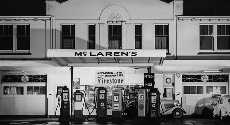
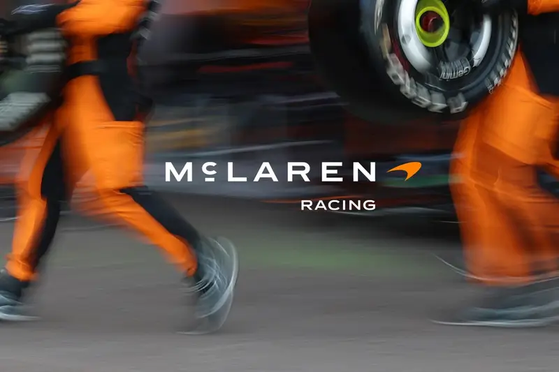
The service station in Remuera, and the new McLaren Racing lockup, images courtesy of McLaren I’m not sure how I feel about the new McLaren Racing lockup—the previous logo, still featured in the navigation bar on the McLaren Racing website, felt more… race-y? The production quality of the film itself, though, is extraordinary. The storytelling is very well done. Restrained, but crackling.
-
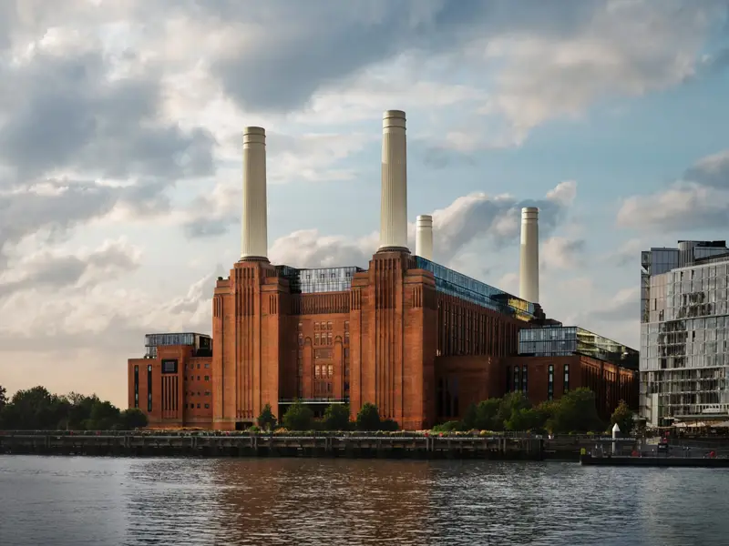
Apple opened a 600-capacity venue inside Battersea Power Station yesterday. The room borrows from the power station it sits in—heritage brickwork, fluted arches, bronze balconies. In an age where concert venues are usually not much more than a black box with a logo over its door, this looks beautifully done.
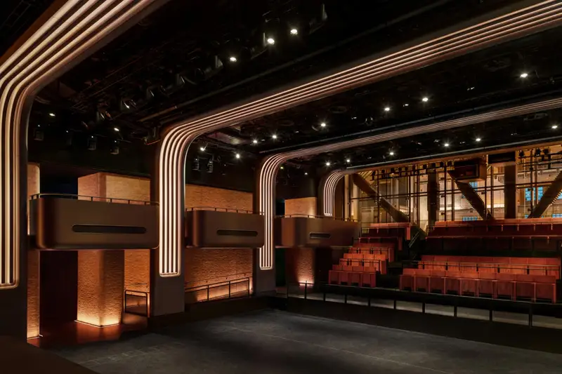

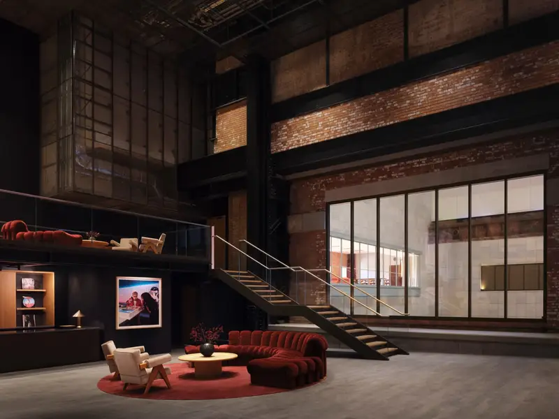
Apple Music Hall and the new Apple Music Radio studios, images courtesy of Apple There are two mix studios, a 48-speaker spatial system around the audience, and sixteen-odd hardwired cameras feeding a broadcast control room. An artist can play one intimate show and leave with a finished Spatial Audio recording, a broadcast mix and multicamera video.
Very clever, and a very expensive way of funneling listeners to an Apple Music subscription. (I guess this explains the push notification I received for a new two-month trial.)
-
“Resolution” is the second movement of A Love Supreme, the 1965 Coltrane album, and Nicholas Payton and Butcher Brown make playing their rendition look like a walk in the park.
This one’s taken from A Supreme Blue, a reimagining of that album alongside Miles Davis’ Kind of Blue. The first five tracks follow the Davis album in order, then come Coltrane’s four parts.
As Jack Kenny puts it on All About Jazz:
A Supreme Blue is not a museum piece but a translation. It reframes two landmark statements through a contemporary sonic language that privileges groove, texture, and atmosphere. House rhythms, electric keyboards, and layered production reshape the modal and spiritual frameworks of the originals, rendering them less austere and more rhythmically grounded.
-
Matthew Butterick’s Practical Typography—reader-supported, ad-free, and still one of the most useful things to read on typography I know. Published on the web since 2013.
Start with “Typography in ten minutes”, five rules that will, as he puts it, make you “a better typographer than nearly every writer—and even most graphic designers”.
My personal favourites to nerd out on: straight and curly quotes, ampersands, paragraph and section marks.
-
My favourites? Too many.
Related reading from 2018, Laurel Schwulst’s “My website is a shifting house next to a river of knowledge. What could yours be?”.
-
A 26-minute documentary by NYT Cooking on what makes a good restaurant sign, and what they mean to a business. They look at New York City’s iconic lettering with the artists behind Noble Signs, who hand-painted signs all over the city. Wonderful work.
-
McLaren M6GT
№ 138The Special Operations team at McLaren restored the McLaren M6GT, a car designed in 1967 by Bruce McLaren, yet never made it past the prototype phase.
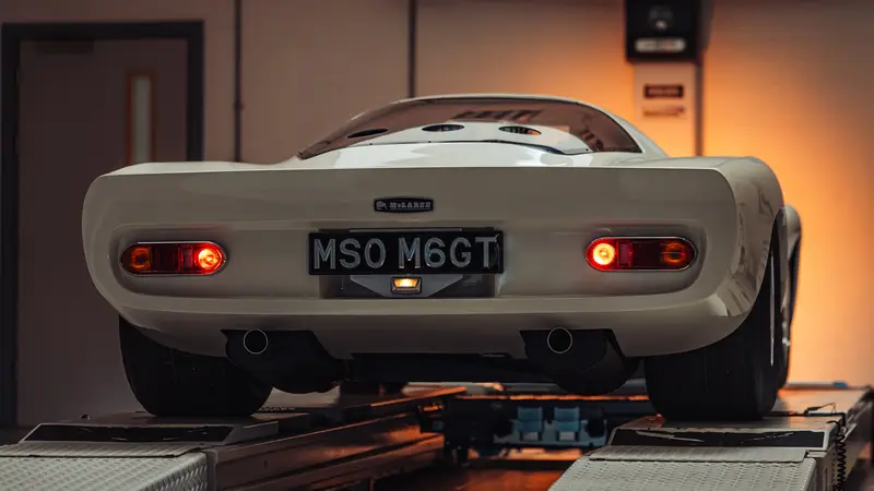
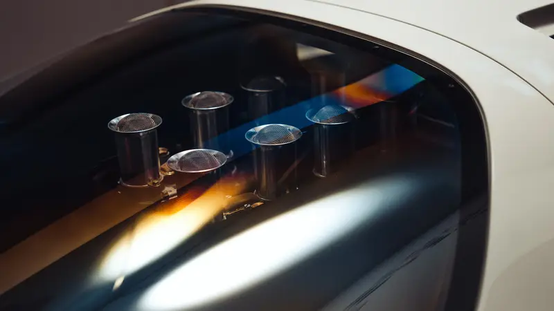
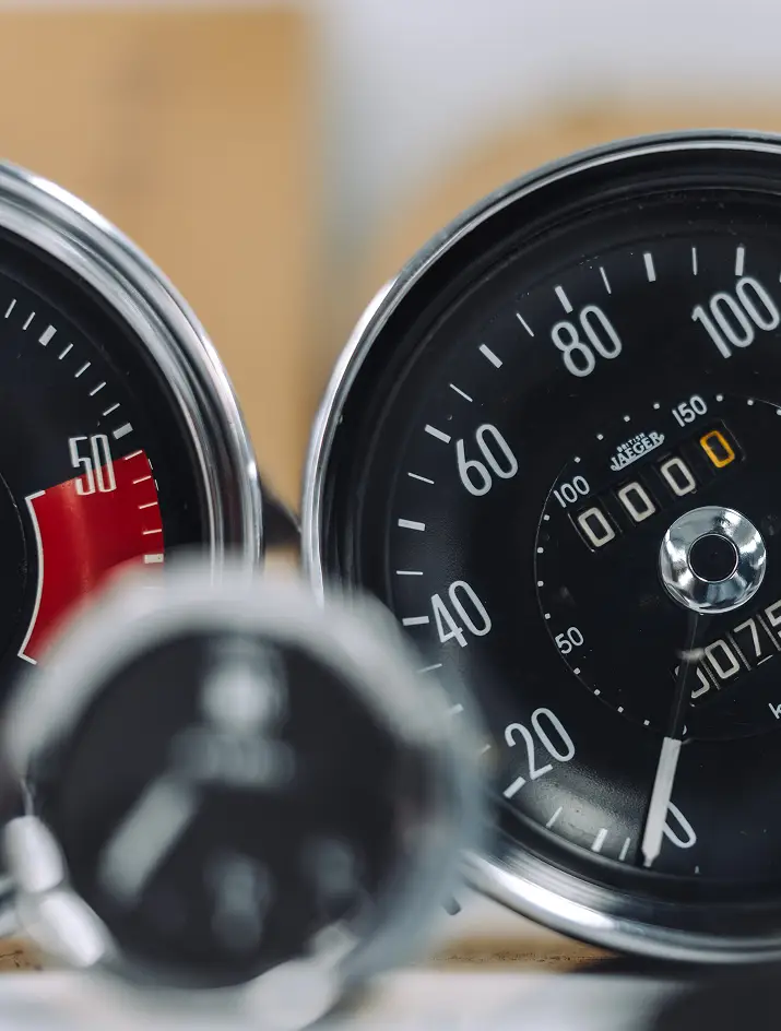
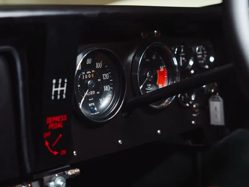
Details of the McLaren M6GT This was never going to be a simple rebuild. We took it as an act of custodianship, with an immense responsibility to stay true to the original vision. The goal wasn’t merely to imitate the M6GT, but to bring it back. Honestly. Faithfully. With the same obsession that Bruce channelled into the original.
There’s a short video of it on YouTube, too. Gorgeous machinery.
-
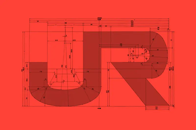
Arun Venkatesan outlines how Japan’s railway companies all carry one logo across thousands of vehicles, maintaining a distinct, shared visual identity for what is actually eight different organisations.
[...] the new corporate identity was commissioned as a single system that would apply across all the companies. In just 124 days — beginning with the passing of railway reform bills — the new JR companies launched across Japan, with new branding applied to every vehicle. The brief was minimal. The designers were given full control, told only that the group had to be called either “Japan Railways” or “Nippon Railways”. It was up to them to find a solution that worked aesthetically and within the constraints.
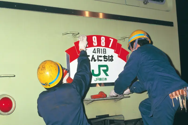
Workers applying the JR branding. Image courtesy of NDC Great story for a great brand identity. Perhaps unsurprisingly, its design process is reminiscent of Studio Ghibli’s, in that an older man struggled to delegate the design work to a younger team, and pulled all-nighters to deliver it.
-
The strangest thing happened in my brain today, where SpaceX’s IPO reminded me of this guitar teacher, who hears Radiohead’s Weird Fishes/Arpeggi for the first time, tries to deconstruct it on the fly, falls for it, and is especially taken by Phil Selway’s drumming like a metronome.
-
Over the past few years I’ve grown to appreciate Jeff Parker (virtuoso guitarist from Chicago) very much. The jazzy, improvised nature of his work—best exemplified on a few of his recent albums, like The Way Out of Easy and Mondays at the Enfield Tennis Academy—is just phenomenal.
The latest album he’s released with his quartet, Happy Today, might be my favourite so far. International Anthem and Nonesuch Records recently uploaded the video of its recording to YouTube, and it is a trip.
Jay Bellerose on drums and percussion, Anna Butterss on acoustic bass, Josh Johnson on alto saxophone—I hope to catch them live all together one day. I can’t believe this has accrued just 14K views so far!