Links
A regularly updated collection of things I find worth reading, watching, or listening to. Subscribe via RSS.
-

The album I didn’t know I needed: Radiohead just released live recordings from their Hail To The Thief era, a somehow, somewhat impopular album of theirs that I love.
Thom Yorke said about it:
In the process of thinking how to build arrangements for the Shakespeare Hamlet/Hail to the Thief theatre production I asked to hear some archive live recordings of the songs. I was shocked by the kind of energy behind the way we played and it really helped me find a way forward. For us, back in the day, the finishing of this record was particularly messy and fraught, we were very proud of it but there was a taste left in our mouths, it was a dark time in so many ways. Anyway we decided to get these live recordings mixed (it would have been insane to keep them for ourselves) by Ben Baptie, who did an amazing job. It has all been a very cathartic process, we very much hope you enjoy them.
This’ll go into my heavy rotation immediately. The energy of this performance of There, There in Buenos Aires alone is tremendous.
-
While designing a bit of UI, I was trying to find out how to type the interpunct symbol (·) on a Mac (alt + shift + 9), and found this fun, geeky little resource by type.today. They have a few different manuals up on the site that go into typographic details on things like quotation marks, spaces, dashes, brackets, and other characters you may not know a lot about. If you like type, this is a fun read.
-
Sticking With It
№ 83Manuel Moreale on sticking with software.
I coded this blog on Kirby back in 2017, and it’s still on it, 8 years later. I’m writing this blog post using IA Writer, an app I’ve been using since April 2012. That’s more than 13 years ago. And the same story applies to pretty much all the apps I use the most: I’ve been using Sublime Text since 2013, Transmit since 2016, and Codekit since 2014.
What he loves about sticking with tools, or software, for the long run, is that he gets to know the people behind them. I can appreciate that. I for one am just glad when people make well-designed software that is built to last; when they charge for it from day one, and are able to continue putting time and effort into developing or maintaining it.
Software I’ve used (and paid for) for years includes iA Writer, Todoist and Lunch Money (referral link). Letterboxd too, although that’s more a social network, less a tool.
My last site ran on Framer for three-ish years. Let’s see if this one, coded with Eleventy, is around in this shape five years from now.
-
Temper Studio
№ 82
Photo by Manuel Peric A friend recently forwarded me Temper Studio, a new tennis brand dropping one product per month during their “rookie season”. As a somewhat obsessive tennis player, I’m a sucker for this (I don’t need these things, but maybe I do?), and my finger’s been hovering over the purchase button for a while now.
The main reason I’m linking to them here is their photography. They were taken by Manuel Peric, and they’ve clearly put a lot of thought and effort into creating photos that make you feel the game; a breath of fresh air in a time where many are trying to cut corners and using AI to produce similar (yet soulless) imagery.
I love how they presented their ball collector, in all its glory.
-
Ghost 6.0
№ 81My ex-colleagues at Ghost just released Ghost 6.0, a major update to their publishing software that includes networked publishing and native analytics.
Ghost publications are now connected with an open network. People can discover, follow, like and reply to your posts across Bluesky, Flipboard, Threads, Mastodon, WordPress, Ghost, and any other social web platform. Distribution is now built-in.
And,
We’re introducing a native analytics suite for Ghost, giving you detailed insights into how your content performs across web traffic, newsletters, and member subscriptions - all in real-time, all from the same place you publish everyday.
Alongside many other improvements, these changes mark a significant milestone for Ghost, and I’m especially keen to see how their integration with the open web evolves.
Give it a whirl with a free trial.
-
I’ve been banging this drum for a while, and will continue doing so, even after leaving my role at Ghost: Substack is not a place for independent writers.
John Gruber offers up a few examples of Substack’s branding trap.
But now they’ve gotten people to call publications on Substack not “blogs” or “newsletters” but “substacks”. Don’t call them that. And as I griped back in December, even the way almost all Substack publications look is deliberately, if subtly, Substack-branded, not per-publication or per-writer branded.
If you’re on Substack, and are now wondering if, why and how you should leave: here’s a neat little resource.
-
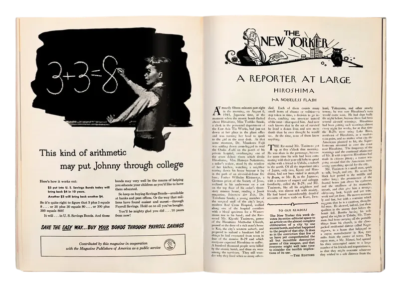
John Hersey’s original story, published in The New Yorker on August 23rd, 1946, revisited by Jane Mayer. It was first published as an article in the magazine, then republished in bookform, and sold many millions of copies. I’ve written about the book before in my newsletter; it’s a harrowing read, but I think it should be read by everyone.
It’s interesting to read about the impact it had at the time.
Stephanie Hinnershitz, a military historian, told me that Hersey’s reporting “didn’t just change the public debate about nuclear weapons—it created the debate.” Until then, she explained, President Harry Truman had celebrated the attack as a strategic masterstroke, “without addressing the human cost.” Officials shamelessly downplayed the effects of radiation; one called it a “very pleasant way to die.” Hinnershitz said, “Hersey broke that censorship.” He alerted the world to what the U.S. government had hidden.
-
Luke Wroblewski argues that AI has flipped software development: first we had designers design a feature, and engineers sort out what code they needed to ship it; now, engineers build a feature using AI, and designers sort out the UX and UI needed to polish it.
I’m unsure if this actually is faster. I’m aware that some of the upfront work designers do can slow things down—there is a balance to how much one should do upfront, and how much should be done in code—but I think designing a feature, ideally, is a little more than “cleaning up” after the engineers, as Luke describes.
There’s quite a lot of collaborative design work (or design thinking, if you will) to be done to enable a designer and/or engineer to effectively (vibe)code their way to a working prototype or feature.
-

A scene from The Brutalist, perhaps:
When we eventually reached a quarry and I got out the car, I felt as if I had walked into an overexposed photograph. The heat and light were obliterating. The quarry looked more like a modern metropolis than a natural landscape: soaring towers, symmetrical grids, improbably clean lines. Heavy machines lurked; giant blocks of freshly quarried stone, stacked like slabs of butter, awaited their ride down the mountain. Small broken bits of marble were everywhere.
It’s a little jarring to read about the Massa-Carrara region in Italy—known for the beautiful marble that decorates our kitchens and buildings—and find that it is among the poorest regions in Tuscany. The profits of the industry bypass the region they mine from, and the ecological effects are devastating, as reported by The Dial.
According to those who have worked in the local quarries for decades, the finest white variety has been entirely depleted; the rest of the quarries could be emptied within 50 years.
-
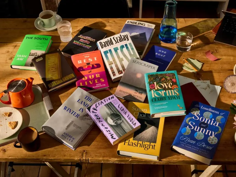
The longlist for the 2025 Booker Prize has been announced.
The 13 novels transport readers to a farm in southern Malaysia, a Hungarian housing estate and a small coastal town in Greece. They shine a light on the lives of Koreans in postcolonial Japan, a homesick Indian in snowy Vermont, a Kosovar torture survivor living in New York, a shrimp fisherman in the north of England, a mother’s search for a child given up for adoption in Venezuela and even endangered snails in contemporary Ukraine. They reimagine the great American road trip as a slow-burning mid-life crisis and take us into the heart of the UK’s coldest winter.
Including a first longlisting for Fitzcarraldo Editions, who just steadily and impressively keep chipping away.