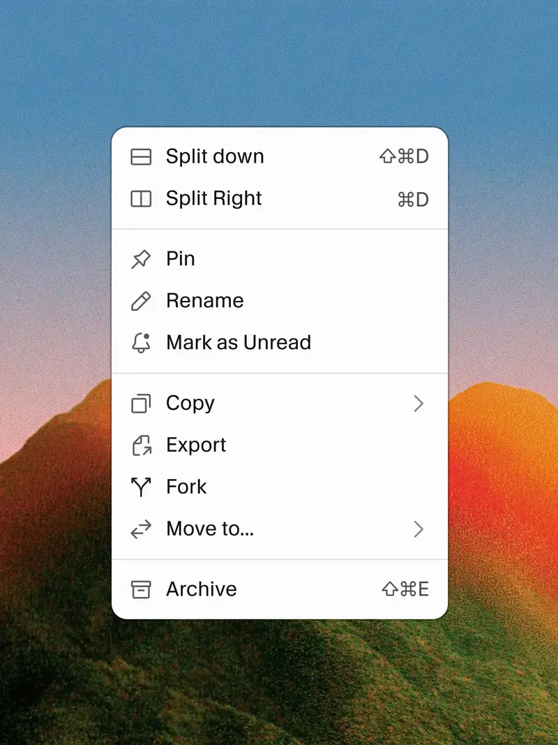
The Making of Cursor’s Icons
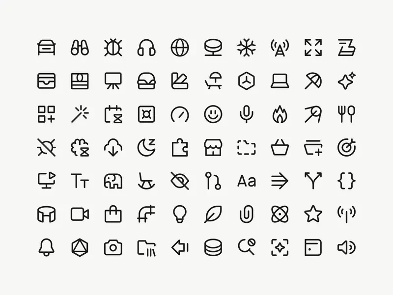
I’ve worked with Marek for years, on projects for IKEA and AutoStore among others, and have always admired his system-level thinking, his craft, and his attention to detail. This project for Cursor is the perfect showcase for all of those abilities. The case study is lengthy, but anything shorter wouldn’t do the work justice.
At 1px the icons felt too thin next to text. It’s hard to say exactly why – they just didn’t hold their own. At 1.5px they felt too heavy. At 1.25px a 16px icon sits beside 16px Cursor Gothic, their custom typeface, and looks just right. You follow your eye on decisions like this. At some point the number is a record of a decision the eye already made.
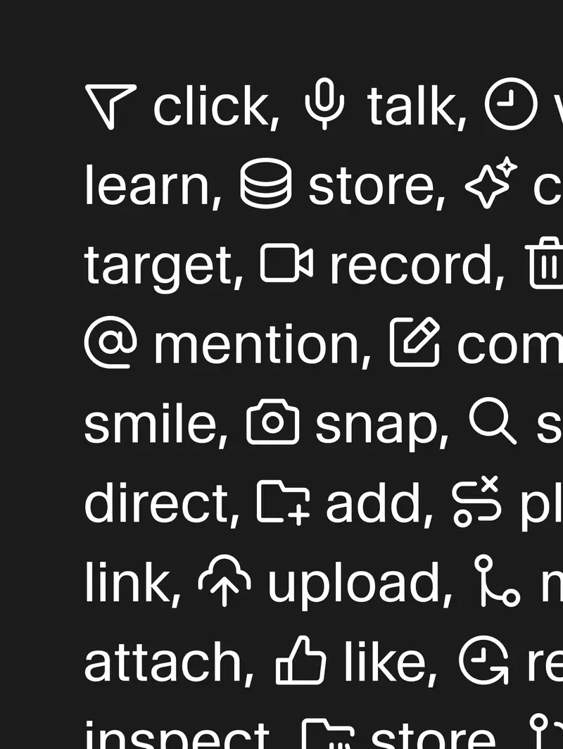
The icons sit perfectly next to Cursor Gothic, and I love seeing this level of craft get prioritised in a product and company like theirs.
Marek walks through the explorations, the dead ends and the reasoning behind every decision, and with this case study he’s created a generous resource for anyone learning the craft.