The old typography is new again
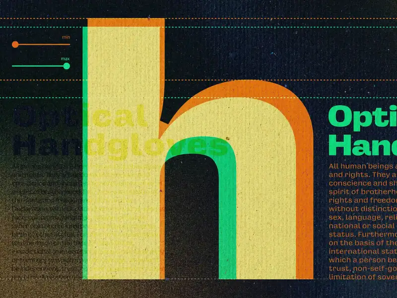
For five centuries, every typeface size was its own unique design. What we now call optical sizing—the practice of adapting a typeface’s design for different sizes to keep it readable—is a modern attempt to preserve that deliberate design choice to honor size-specific type, even though the physical reasons for it no longer apply.
A nice reminder by Elliot Jay Stocks on optical sizing in typography, and how variable fonts quietly restore this craft. Using opsz, the browser already maps font-size to the right optical size for you, but you can take it one step further and tweak it by hand for different resolutions (as Elliot has done on his personal website).
Similar to his, my site uses Oh No Type Co’s Degular too, and I have optical sizing enabled as well. You’ll see it render differently in page titles than it does in the inline opsz here in the body copy.