Links
A regularly updated collection of things I find worth reading, watching, or listening to. Subscribe via RSS.
-
If you’ve been following this website for a while, you’ll know I’m a stickler for typographic details. So I was relieved to find Smart Typography, an Obsidian plugin that does to typography what any app should when you’re writing prose.
Since I started using Obsidian, its straight quotes and apostrophes have been nagging me. This plugin by Matthew Meyers fixes them as you type:
""becomes “curly double quotes”''becomes ‘curly single quotes’, and apostrophes are no longer straight...becomes an ellipsis…--becomes an en dash (–), and one more hyphen turns it into an em dash (—)->and<-become arrows (→ and ←), and1/2becomes ½
Any change can be undone with a single backspace, so it stays out of the way when you actually need a straight quote or two hyphens. Your Markdown files keep the proper characters, too—wherever you take them next.
-
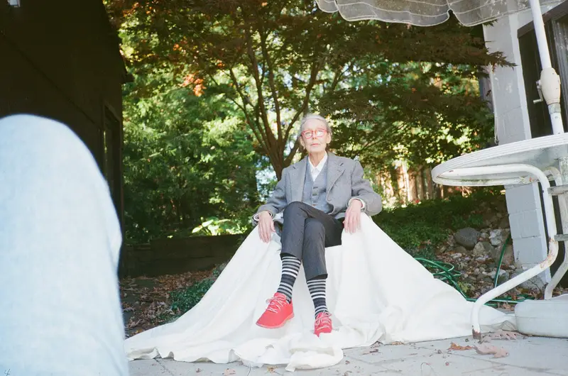
Anne Carson, 2021. Photo by Christopher Sherman One more on Anne Carson, this time by Ella Frears, who I am proud previously wrote for TRANSCRIPT. She makes the case in ArtReview for Carson as a Laureate for our times: endlessly curious, irreverent, easily bored.
When asked what drives Carson to change form with every book, she answered:
Boredom, I guess.
Frears covers Carson’s range beautifully, and ends on a reading in a London bookshop in 2013:
There is no such thing as highbrow or lowbrow in Carson’s oeuvre – there is only interest and language; boredom and brilliance.
-
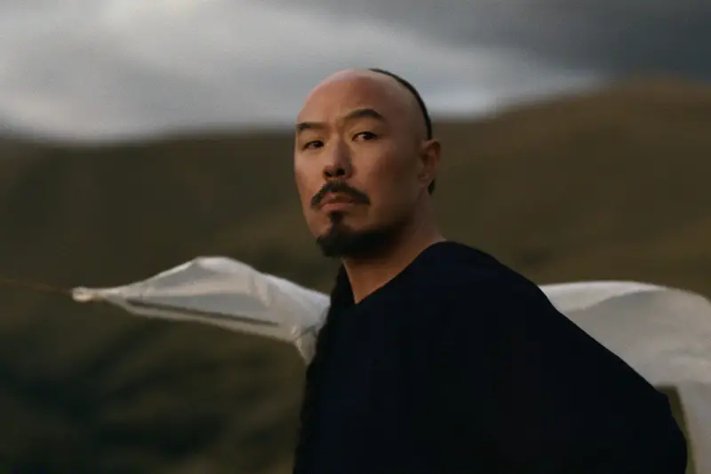
Hoon Lee as Lee in East of Eden. Image courtesy of Netflix Over the last two days my partner and I started and finished East of Eden, Zoe Kazan’s adaptation of the John Steinbeck novel, which I haven’t read. It engulfed us from the first episode. I much prefer a limited series to one built to run for seasons: its makers have to be precise, because there is no time to waste.
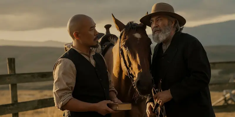
Hoon Lee as Lee and Ciarán Hinds as Sam Hamilton. Image courtesy of Netflix Kazan delivered a fantastic piece of work, and Florence Pugh is great as Cathy Ames, but it’s Ciarán Hinds as Sam Hamilton and Hoon Lee as Lee, the Chinese American caretaker of the Trask family, I will remember most. Lee stole the show.
Here he is talking to Esquire about what the book and the show did to him. He hadn’t read the novel either, until the audition scenes arrived. He finished it in a weekend.
No matter what happened with the audition, I felt the book had come to me as a gift. When I went into that audition, it was almost to thank them for bringing me the book.
-
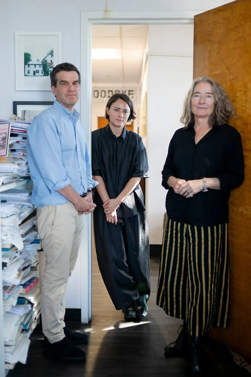
Declan Spring, Mieke Chew and Barbara Epler of New Directions. Photo by Vincent Alban for The New York Times In light of Anne Carson winning the Nobel Prize for Literature (so very much deserved), I was hoping for profiles to hit the internet and found this one, on New Directions, Carson’s publisher. They keep winning Nobels (much like Fitzcarraldo).
-
In Defense of the Detour
№ 147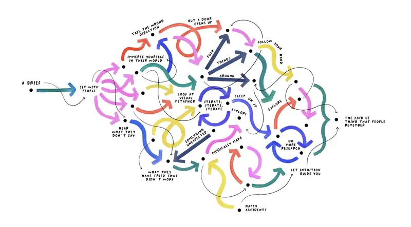
Illustration by Giorgia Lupi Giorgia Lupi, whose 1,374 Days I shared last year, is back in The New York Times with a visual essay on craft and AI. AI is useful when the problem is well-defined, but design and art are about getting lost along the way.
You immerse yourself in the world of the people you’re designing for, look for visual metaphors, stumble onto something unexpected, and push things around until they break, or until they make sense.
Anything worth remembering came from a person who did not know where she or he was going until arriving. No shortcut gets you there: the process leaves a trace.
She doesn’t dismiss the tools; her team uses AI too, but only once the design is done, to help carry it out at scale. The design is in the detour.
-
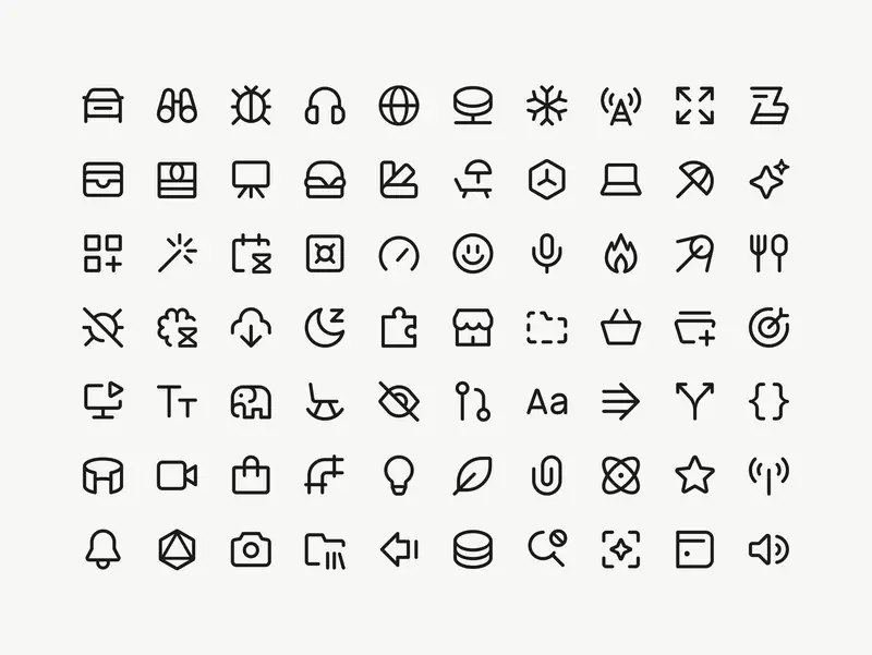
Images courtesy of Marek Minor I’ve worked with Marek for years, on projects for IKEA and AutoStore among others, and have always admired his system-level thinking, his craft, and his attention to detail. This project for Cursor is the perfect showcase for all of those abilities. The case study is lengthy, but anything shorter wouldn’t do the work justice.
At 1px the icons felt too thin next to text. It’s hard to say exactly why – they just didn’t hold their own. At 1.5px they felt too heavy. At 1.25px a 16px icon sits beside 16px Cursor Gothic, their custom typeface, and looks just right. You follow your eye on decisions like this. At some point the number is a record of a decision the eye already made.
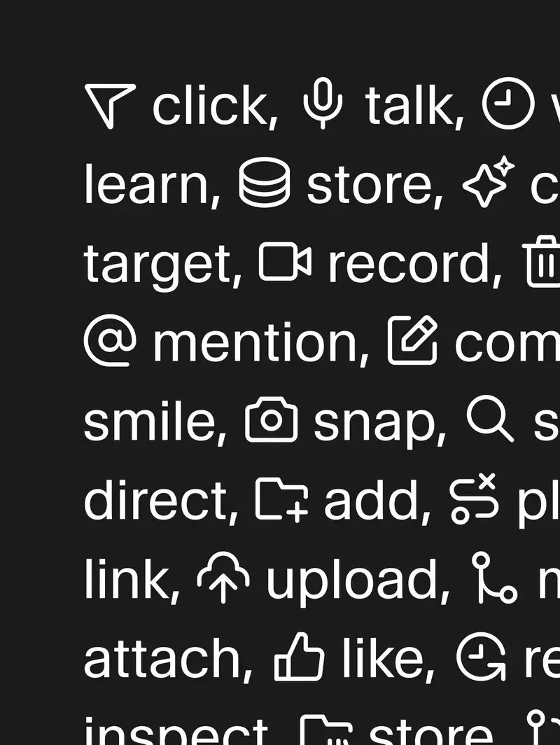
The icons set inline with Cursor Gothic The icons sit perfectly next to Cursor Gothic, and I love seeing this level of craft get prioritised in a product and company like theirs.
Marek walks through the explorations, the dead ends and the reasoning behind every decision, and with this case study he’s created a generous resource for anyone learning the craft.
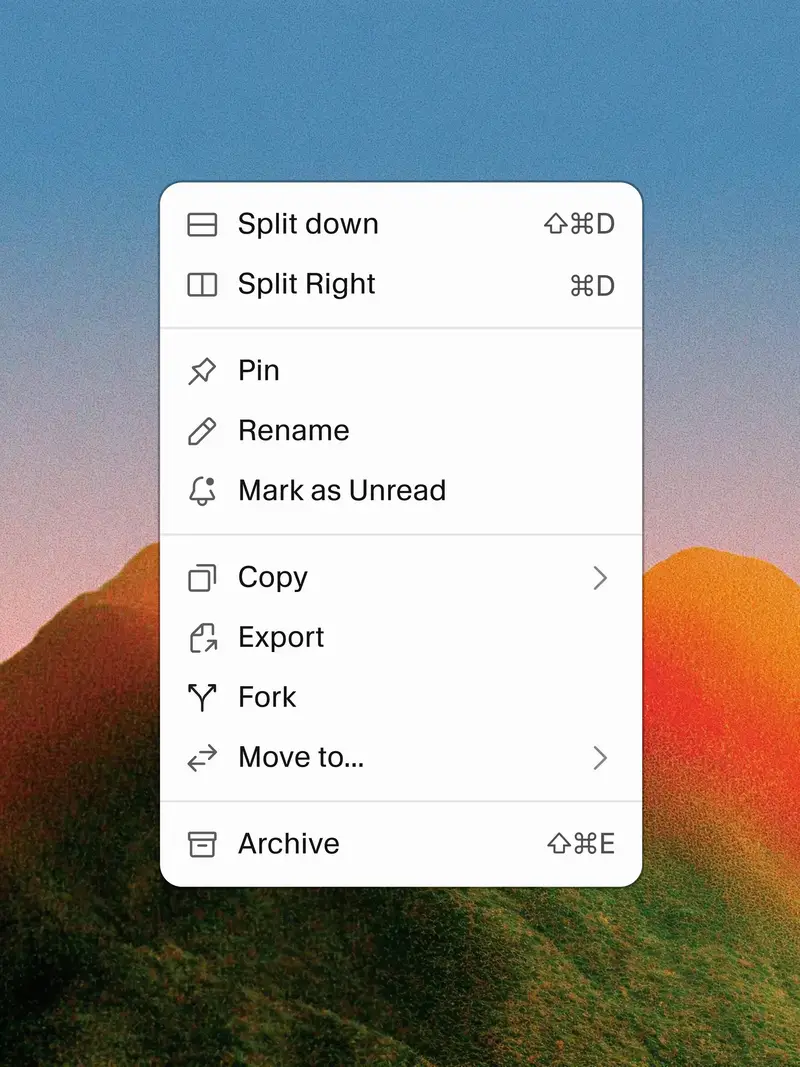
The icons in one of Cursor’s context menus -
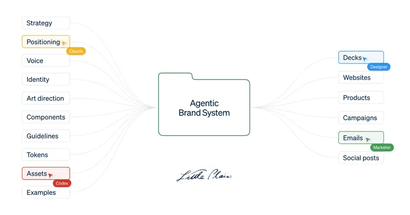
Image courtesy of Little Plains Little Plains makes the case for Agentic Brand Systems: kits of visual rules, voice guidelines and working code that guide people and agents alike, so a brand doesn’t drift as it spreads across more tools and teams.
Give the same assignment to an agent and it guesses at a much higher rate. The result may look completely competent. However, each unsupported choice moves the work a little closer to what a generic product would do. It’s not slop, it’s just…mid.
Interesting times for brand studios, and for those commissioning them. Scaling a (re)brand is becoming (unavoidably) more agentic. Rolling out and levelling up a company’s brand expression is technically easier than ever, but the surface area you need to cover has grown quite a bit. We’re going to need to grow a few extra pairs of eyes.
-
McLaren revealed an evolved identity this month, the road cars and the racing team now sharing the same voice.
The Speedmark stays, and so does the Papaya colour. What’s new is the wordmark, sourced from the service station that Bruce McLaren’s parents, Les and Ruth, ran in Remuera, Auckland. That’s where Bruce McLaren built the car that won him his first race.
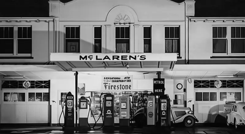
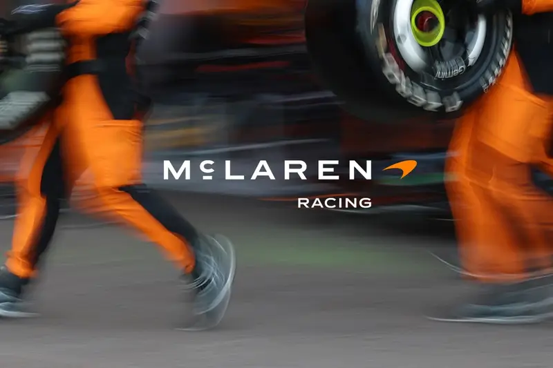
The service station in Remuera, and the new McLaren Racing lockup, images courtesy of McLaren I’m not sure how I feel about the new McLaren Racing lockup—the previous logo, still featured in the navigation bar on the McLaren Racing website, felt more… race-y? The production quality of the film itself, though, is extraordinary. The storytelling is very well done. Restrained, but crackling.
-
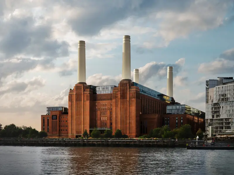
Apple opened a 600-capacity venue inside Battersea Power Station yesterday. The room borrows from the power station it sits in—heritage brickwork, fluted arches, bronze balconies. In an age where concert venues are usually not much more than a black box with a logo over its door, this looks beautifully done.
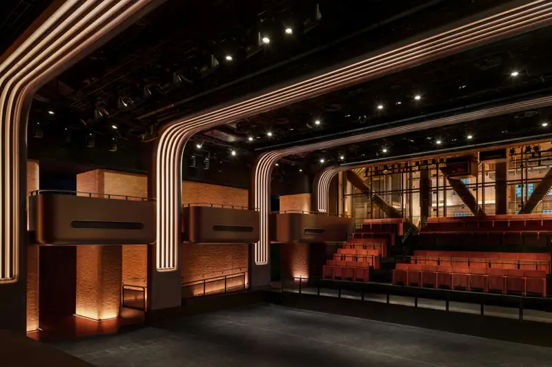

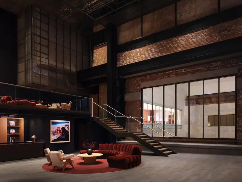
Apple Music Hall and the new Apple Music Radio studios, images courtesy of Apple There are two mix studios, a 48-speaker spatial system around the audience, and sixteen-odd hardwired cameras feeding a broadcast control room. An artist can play one intimate show and leave with a finished Spatial Audio recording, a broadcast mix and multicamera video.
Very clever, and a very expensive way of funneling listeners to an Apple Music subscription. (I guess this explains the push notification I received for a new two-month trial.)
-
“Resolution” is the second movement of A Love Supreme, the 1965 Coltrane album, and Nicholas Payton and Butcher Brown make playing their rendition look like a walk in the park.
This one’s taken from A Supreme Blue, a reimagining of that album alongside Miles Davis’ Kind of Blue. The first five tracks follow the Davis album in order, then come Coltrane’s four parts.
As Jack Kenny puts it on All About Jazz:
A Supreme Blue is not a museum piece but a translation. It reframes two landmark statements through a contemporary sonic language that privileges groove, texture, and atmosphere. House rhythms, electric keyboards, and layered production reshape the modal and spiritual frameworks of the originals, rendering them less austere and more rhythmically grounded.