Links
A regularly updated collection of things I find worth reading, watching, or listening to. Subscribe via RSS.
-

A scene from The Brutalist, perhaps:
When we eventually reached a quarry and I got out the car, I felt as if I had walked into an overexposed photograph. The heat and light were obliterating. The quarry looked more like a modern metropolis than a natural landscape: soaring towers, symmetrical grids, improbably clean lines. Heavy machines lurked; giant blocks of freshly quarried stone, stacked like slabs of butter, awaited their ride down the mountain. Small broken bits of marble were everywhere.
It’s a little jarring to read about the Massa-Carrara region in Italy—known for the beautiful marble that decorates our kitchens and buildings—and find that it is among the poorest regions in Tuscany. The profits of the industry bypass the region they mine from, and the ecological effects are devastating, as reported by The Dial.
According to those who have worked in the local quarries for decades, the finest white variety has been entirely depleted; the rest of the quarries could be emptied within 50 years.
-
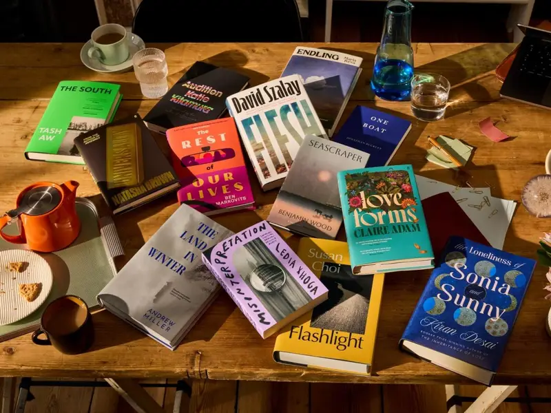
The longlist for the 2025 Booker Prize has been announced.
The 13 novels transport readers to a farm in southern Malaysia, a Hungarian housing estate and a small coastal town in Greece. They shine a light on the lives of Koreans in postcolonial Japan, a homesick Indian in snowy Vermont, a Kosovar torture survivor living in New York, a shrimp fisherman in the north of England, a mother’s search for a child given up for adoption in Venezuela and even endangered snails in contemporary Ukraine. They reimagine the great American road trip as a slow-burning mid-life crisis and take us into the heart of the UK’s coldest winter.
Including a first longlisting for Fitzcarraldo Editions, who just steadily and impressively keep chipping away.
-
Researchers at MIT’s Media Lab published a study titled Your Brain on ChatGPT: Accumulation of Cognitive Debt when Using an AI Assistant for Essay Writing Task, and the results are somewhat concerning. 54 subjects were divided into three essay-writing groups (one using ChatGPT, one using Google, and one using nothing at all).
Researchers used an EEG to record the writers’ brain activity across 32 regions, and found that of the three groups, ChatGPT users had the lowest brain engagement and “consistently underperformed at neural, linguistic, and behavioral levels.”
Over months, ChatGPT users got lazier and lazier.
The paper has not been peer reviewed yet, but its authors wanted to release it ahead of time to draw attention to the long-term effects of outsourcing our thinking. As they said, about those who used ChatGPT to write their essays: “the task was executed, and you could say that it was efficient and convenient. But as we show in the paper, you basically didn’t integrate any of it into your memory networks.”
My own usage of ChatGPT, or AI in general, is primarily for outsourcing otherwise tedious work that stops me from being creative (a recent example: using Warp to dive into documentation for Eleventy or Ghost, to help me set up a basic framework to start building sites). Using AI as a tool for learning or understanding, rather than mindless creation.
-
Tyler, The Creator sat down with a group of creatives to have a candid conversation about creativity, taking chances, and believing in the things you make. I must’ve watched this two weeks ago and—despite the sponsored element to this—found it very inspiring (as I do all of his output in recent years; Tyler is one of the artists I admire the most).
I loved how he mentioned the shift he noticed in how people perceived him, once he put “all songs written, produced and arranged by Tyler Okonma” on his album covers. It feels like his creative output has been unmatched since then.
How he created, marketed and released his latest album Don’t Tap The Glass—while on a worldwide tour of over 100 shows—is a testament to that.
-
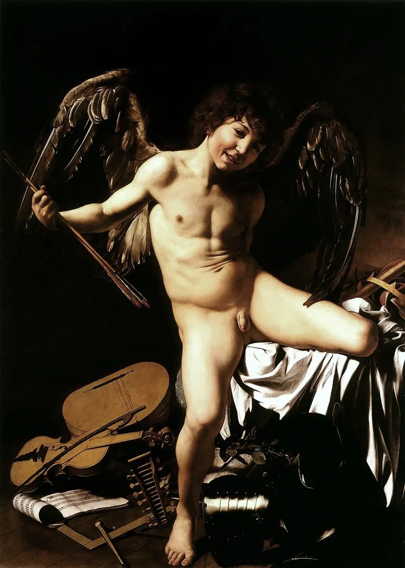
Caravaggio’s Amor Vincit Omnia (“Triumphant Eros”), 1602 The other day I decided to look up Nicholas Jeeves, who taught me when I attended an exchange program at Anglia Ruskin University in Cambridge (UK), over a decade ago.
A lot of his work was new to me, as was this essay, first published in The Public Domain Review. It’s an essay that explores the history of the smile through the ages of portraiture, and an especially nice read as I make my way through The Story of Art. His mention of Gerrit van Honthorst’s The Laughing Violinist (1624) put a great big smile on my face.
-
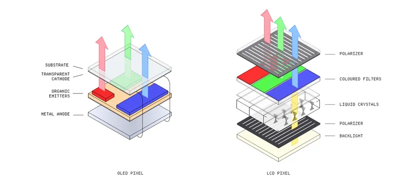
Dan Hollick is writing and illustrating a “reference manual for people who design and build software”, and he just released its first chapter: How does a screen work?. And, I appreciate him starting with the hardware before digging into the software:
[...] most people have no idea how a screen works. Any time you see a pixel light up, you are witnessing actual witchcraft before your eyes - light bending through electric crystals just so you can read a tweet in bed.
It reminded me of Wim Crouwel’s New Alphabet, a typeface (or typographic experiment) he created in response to the technology found in a CRT monitor.
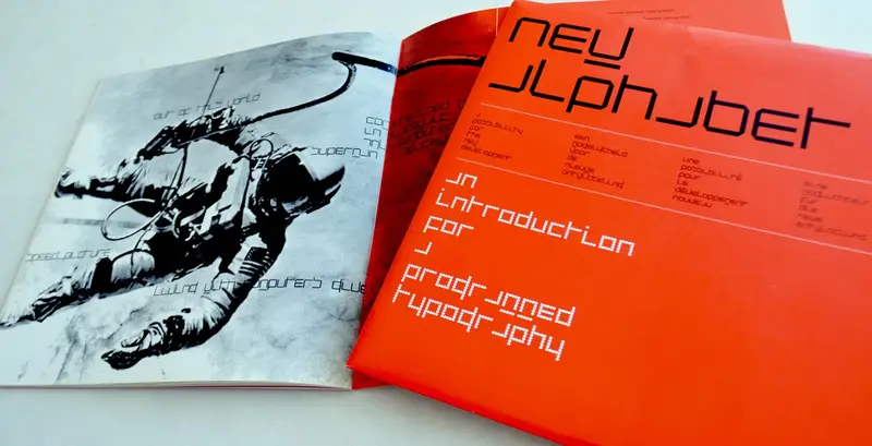
Implied in that experiment was an urge to truly understand the technology his work was created for or displayed on. It seems Dan’s manual is aiming for a similar rigorousness, which is exciting!
-
Why We Quit Spotify
№ 71Hearing Things, an independent music publication, on why they’ve decided to stop hosting their playlists on Spotify. The decision comes after Spotify CEO Daniel Ek’s investment in defense startup Helsing and Spotify’s latest policy change, denying royalties to songs with under 1,000 streams.
I’ve long been on the fence about Spotify. The platform has become ever more convoluted, its business decisions increasingly indefensible. From a design and user friendliness point of view, there’s an exorbitant amount of friction, too.
It seems to me there’s a great big gap in the market that a forward-thinking, music-loving organisation could step into. Think... the 2025 version of Rdio?
-
Flounder Mode
№ 70
If this is a way of living and working that’s available to all of us, why do we fetishize the white-knuckling and pain?
More of an essay on than a profile of Kevin Kelly, written by Brie Wolfson, for Colossus Review. Reading the piece is like seeing Brie’s eyes being opened by Kelly’s way of living, working, and being.
I wasn’t so familiar with Kelly, and this has made me want to dig deeper. A fascinating and inspiring person, whose working methods I think I very much agree with.
-

First shared with me by Timo, Christoph Niemann confonts his fears about A.I. art, using smart illustrations and storytelling, in The New York Times Magazine.
My survival as an artist will depend on whether I’ll be able to offer something that A.I. can’t: drawings that are as powerful as a birthday doodle from a child.
-
The Onion’s process is deeply, beautifully inefficient. Every day, our writers take 150 headlines into a physical writers room in Chicago and whittle them down to maybe one or two. These people throw away the funniest sentence I will ever write in my life six times by noon every weekday.
A great chat with Ben Collins, chief executive of The Onion, how they’re “thriving by saying what others won’t—and why human-created satire matters in a media landscape increasingly saturated by noise and A.I. slop” on Status.
You have to subscribe (for free) to read it, and it’s worth it.